Our grant from the Water Foundation gave me an excuse to dive deep into a big statewide dataset collected by the Iowa DNR. I presented some of that analysis (along with general tips for data analysis) at the Iowa Water Summit in October. Since my slides rarely make sense without the narration, I have also written up a series of set of three case studies about trend monitoring.
I started learning R, a computer programming language for data science and statistics, in 2020. There was a steep learning curve, but now I get to coast downhill. If I can make an interactive map to display which chloride and phosphate readings from a volunteer event fall into the “good” category, I can reuse a lot of that code to make another interactive map that shows which lakes meet the recreation standard for E. coli. If I can figure out how to overlay maps of watersheds and animal feeding operations to calculate livestock density for 60 monitoring sites, it’s not hard to adapt that to calculate a similar metric for wastewater treatment plants. If I can make a good graph for one site, it’s not hard to scale that up to 50 sites.
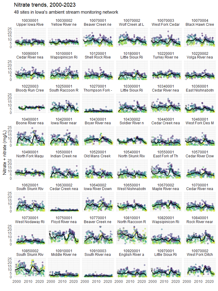
Behold! My finest graph yet! On a single page, you can see 20 years of monthly nitrate data for the 48 sites in Iowa’s Ambient Stream Monitoring network with the longest record. The dots are color-coded to show streamflow at the nearest gage on the day the water samples were collected, yellow when water levels were at their lowest and grading to purple when water levels were at their highest. The black line is a 3-year moving average (or at least a close approximation with LOESS). You’ll notice that nitrate levels in most streams shot up sometime around 2014 and have been declining since. But how much of that is a precipitation-related trend tied to the El Niño-Southern Oscillation and how much is due to conservation efforts in the watershed?

In 2022, I came up with a little data visualization magic trick to try to correct for some of the influence of streamflow on water quality, and by 2023, I was starting to think it had promise. It’s not as reliable as Weighted Regression on Time, Discharge and Season or using ANCOVA in a paired watershed study, but it’s a lot easier to explain.
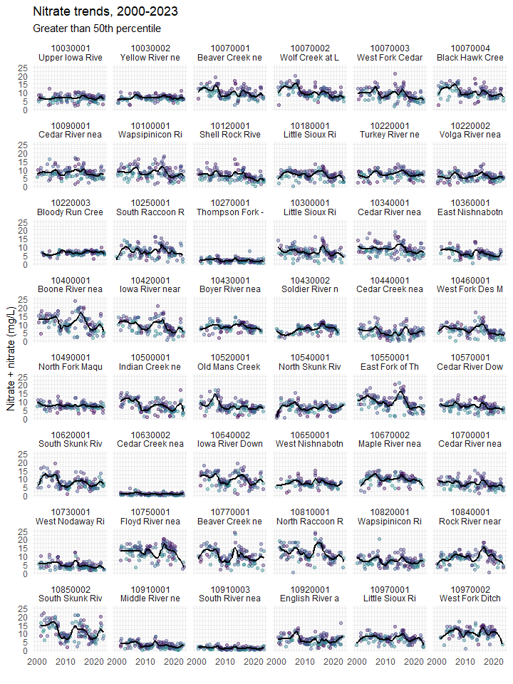
Here comes the magic trick! Watch closely, for when I place into my hat all those samples collected when streamflow was lower than average (yellow and green dots) some of these apparent nitrate trends will…. disappear!

Darn it, that didn’t work at all! For the third of three case studies I’ll link to below, I take a closer look at two of these sites: Black Hawk Creek, where I’d expect a moderate improvement based on cover crop acreage and the East Fork of the Des Moines River, where I’d expect very little improvement. The East Fork actually has a much bigger nitrate trend than Black Hawk Creek and I can’t account for it. Maybe I should give up and leave trend monitoring to the experts at Iowa State University and Iowa DNR, they seem to know what they’re doing (see Danalatos et al. 2022).
However, the trick did work when I compared a watershed impacted by mostly point sources of pollution (i.e. sewage treatment plants) to a watershed impacted by mostly non-point source pollution (i.e. agricultural runoff). This is the first of the three case studies. Phosphorus concentrations have increased in the North Raccoon River and decreased in the South Raccoon has decreased, but that’s entirely due to recent drought. The second case study introduces a new metric for identifying rivers that a strongly influenced by point source pollution, and how to track improvement.
Report: Three case studies for monitoring water quality trends in Iowa

Interesting and informative. Well written with clever wordsmithing.